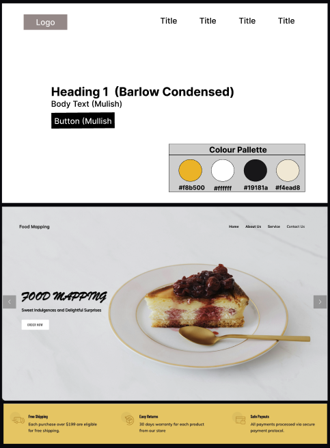
Food Mapping
A high-performance discovery platform built to master the fundamentals of responsive web design without relying on heavy libraries.
Clean Code Structure
I focused on writing code that is easy to read and understand. By using the correct HTML tags (like Headers and Sections), I ensured the site is organized for other developers and easy for search engines like Google to read.
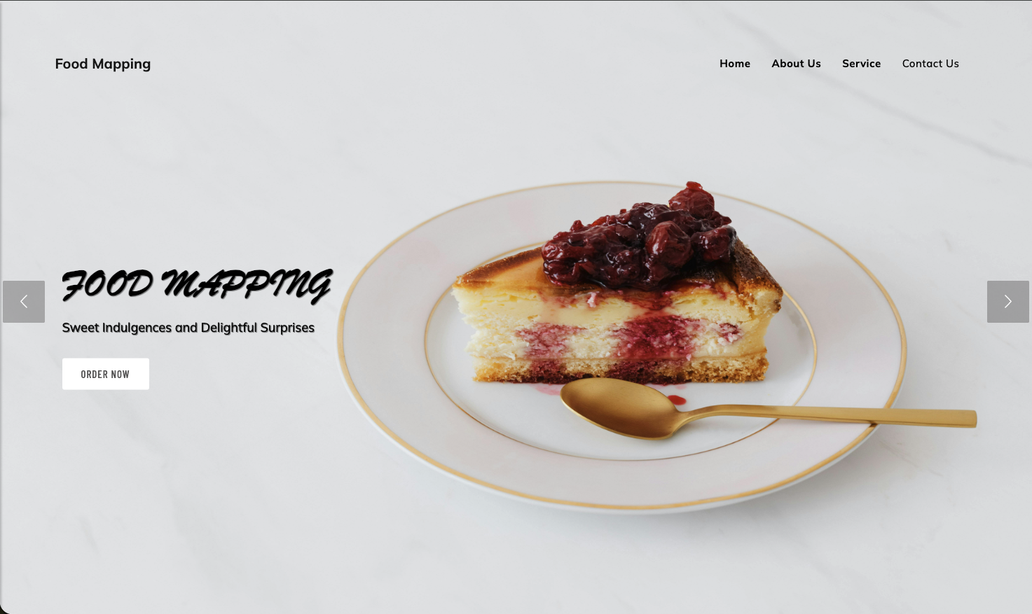 Foundation: Writing clean code that is easy to
maintain.
Foundation: Writing clean code that is easy to
maintain.
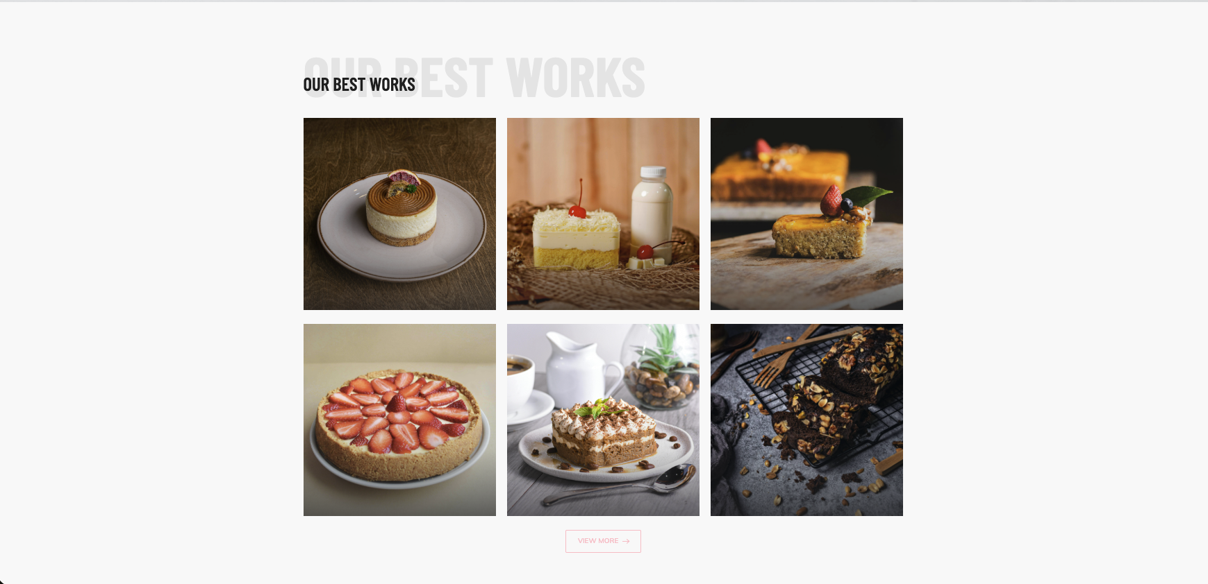 Layout: A photo gallery that changes shape to fit the
screen.
Layout: A photo gallery that changes shape to fit the
screen.
Responsive Photo Grid
I used CSS Grid to build this gallery. It automatically changes from a 3-column layout on computers to a single column on phones. This ensures the images look great on any screen size without breaking.
Reusable Card Styles
Instead of writing new code for every review, I created one "Card" style and reused it. This keeps the code efficient - if I want to change the design later, I only have to edit it in one place to update all the cards.
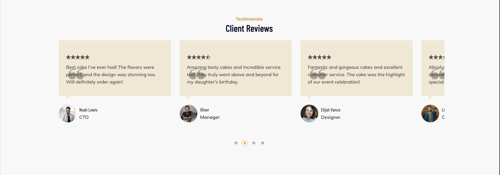 Efficiency: Writing code once and reusing it many
times.
Efficiency: Writing code once and reusing it many
times.
 Alignment: Keeping icons and text perfectly centered.
Flexible Alignment
I used CSS Flexbox to align these icons and text. This ensures that everything stays perfectly centered and spaced out evenly, no matter how wide or narrow the user's screen is.
Design Philosophy: High-Contrast Culinary UI
The "Hero Product" Focus
By utilizing a deep charcoal background, the interface maximizes the vibrancy of the products. This creates a high-end "digital menu" experience that focuses on sensory appeal before introducing the technicality of shopping.
Establishing Digital Credibility
The architecture prioritizes psychological safety by positioning specific service guarantees - such as delivery reliability and secure protocols - directly within the user's path. This ensures a small-scale artisanal shop builds immediate trust, even before the e-commerce transition.
Modular Growth Roadmap
A modular Bento-grid system ensures that the visual experience remains the priority. This flexible framework allows the business to showcase a "Best Works" gallery today, while providing the structural foundation to integrate full shopping modules as the brand scales.